




Jan. 01, 1970
For buyers searching for a baroque resort shirt manufacturer, the challenge is not finding a loud print; it is finding a shirt that looks distinctive in vacation pictures without feeling theatrical at dinner. The strongest direction combines men’s baroque print resort shirts, a relaxed camp collar, measured textile GSM, and reliable colorfastness. Collections such as luxury baroque shirts for men and custom baroque resort shirts are moving toward wearable scale, breathable silk-blend or cotton fabrics, and digital sublimation printing. That gives retailers a clearer product story: statement style, controlled production, and practical resort comfort.
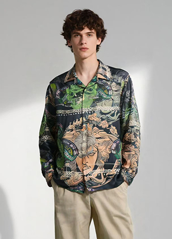
Baroque fashion is recognizable through scrolling foliage, shell forms, architectural frames, cherubs, ornamental borders, and high-contrast metallic-looking details. On a men’s resort shirt, these elements create visual impact without requiring embroidery, tailoring, or additional accessories.
The commercial opportunity comes from a simple change in customer behavior. A resort shirt is now expected to perform in several settings: airport travel, poolside wear, hotel dining, evening events, and social-media pictures. A print that works only under bright sunlight has limited value. Buyers increasingly want one garment that can be worn open over a plain T-shirt during the day and buttoned with tailored trousers at night.
Industry reporting supports this value-focused environment. The State of Fashion 2025, published by McKinsey & Company and The Business of Fashion, describes a fashion market shaped by cautious consumer spending, uneven growth, and stronger pressure to prove product value. That does not specifically measure baroque shirts, but it is relevant to resortwear: a visually distinctive shirt must also demonstrate fabric quality, fit consistency, durability, and styling versatility.
Material claims should be checked rather than assumed. The U.S. Federal Trade Commission’s Care Labeling Rule requires manufacturers and importers to provide care instructions that are accurate and supported by a reasonable basis. Similarly, color performance should be discussed with a named test method, such as AATCC TM61 for accelerated laundering or ISO 105-C06 for domestic and commercial laundering colorfastness. These tests are not identical to every consumer’s washing routine, so a responsible product description should state the method and conditions instead of promising that a shirt will “never fade.”
Minimal resortwear remains useful, but a plain cream or navy shirt can be difficult to distinguish in a crowded retail assortment. Baroque prints offer immediate recognition from a distance. A retailer can create a strong visual identity through a repeat pattern, a border placement, or a signature palette without changing the base silhouette.
The most effective approach is controlled maximalism. Instead of covering every inch with equal visual weight, designers can combine:
Resort customers often pack fewer garments than they would for a long city trip. This makes fabric weight and styling flexibility commercially important. A practical shirt specification might use a fabric in the 110–150 GSM range for a lightweight warm-weather hand, while a 160–190 GSM fabric may provide more opacity and structure for evening wear. GSM describes fabric mass per square metre; it does not, by itself, prove softness, breathability, or quality.
A relaxed camp collar, side vents, a straight hem, and a slightly generous sleeve opening support movement in warm climates. However, “oversized” should be translated into measurements. For example, a sample size medium might specify a 56–59 cm half-chest measurement, a 72–75 cm back length, and a 23–25 cm sleeve length, depending on the target market and silhouette. Buyers should approve a graded measurement chart rather than relying on a generic label such as “relaxed fit.”
Engineered placement means that artwork is positioned in relation to the garment pattern pieces rather than printed as a random repeating field. The front panels can mirror each other, a large medallion can sit below the chest, and a border can follow the sleeve opening.
This technique reduces the chance that an important motif will be cut through the placket or hidden beneath a pocket. It also gives a shirt a more tailored appearance. For production, the factory should approve a full-size placement file, pattern-panel map, seam allowance treatment, and tolerance range before bulk cutting. A practical approval standard may specify that the center motif must remain within 5–10 mm of the approved position, subject to the factory’s cutting capability.
For Meninthemirror, engineered placement can be presented through pictures that show the front, side, and back of the garment separately. A close-up picture of the placket alignment is more useful to a buyer than a single heavily styled lifestyle photograph.
Not every customer wants gold ornament on a black background. Tonal baroque shirts use a narrow color range, such as charcoal and black, ivory and sand, or deep olive and muted bronze. The pattern remains detailed, but the contrast is controlled.
A useful production target is a measured color difference rather than a subjective promise of “subtle luxury.” During approval, the brand can compare the strike-off with the approved color standard under daylight and store lighting. If instrumental color measurement is used, the supplier should record the system and tolerance, such as a CIE L*a*b* comparison with an agreed Delta E limit. The limit must be agreed by the buyer and supplier because acceptable tolerance depends on fabric, dye class, print process, and visual use.
Tonal designs also improve repeat wear. A customer may style a dark baroque shirt with white trousers, denim, black shorts, or a lightweight suit. That broader wardrobe compatibility can increase the number of occasions in which the garment is used.
Digital textile printing allows artwork to be transferred directly from a digital file without the screen setup required by traditional rotary screen printing. It is particularly useful for detailed ornamental lines, photographic texture, gradient shading, and short-run color testing.
Its benefits should not be overstated. Print quality depends on fabric preparation, ink chemistry, curing or fixation, pretreatment, and washing. A supplier should provide a strike-off on the actual production fabric, not only a paper proof. The approval process should check:
For a buyer developing custom baroque resort shirts, a digital sample can reduce the risk of committing to an unsuitable colorway. It does not eliminate the need for a production trial, because sample-to-bulk variation may still occur.
Responsibility is becoming a purchasing factor, but it needs specific language. “Eco-friendly” is too broad unless the seller explains the fiber content, certification, finishing process, and care requirements.
Possible material directions include certified organic cotton, recycled polyester, linen blends, and cellulosic fibers from suppliers that can provide relevant chain-of-custody documentation. Each choice has trade-offs. Linen can crease more visibly; recycled polyester may retain odor differently from cellulosic fibers; viscose and other regenerated fibers require careful attention to wet strength and shrinkage.
The fiber composition should match the performance requirement. A 100% cotton shirt may provide a familiar natural hand, while a cotton-modal or cotton-viscose blend may offer a softer drape. A polyester-rich fabric may support vivid digital printing and lower drying time, but the product description should not imply that it has the same moisture behavior as linen or cotton.
Customization in baroque resortwear is expanding from monograms to controlled artwork changes. Buyers may request a different border color, a smaller motif scale, an adjusted sleeve print, or a private-label placement. These changes are more commercially useful than adding a small logo to an unchanged shirt.
To control cost and production errors, customization should be divided into levels:
Every level should have a written approval record. This is especially important when the shirt will be photographed for an online launch, because the pictures, product page, care label, and delivered garment must describe the same version.
Print scale is one of the fastest ways to change a shirt’s customer appeal:
| Print direction | Typical visual effect | Best use | Production consideration |
|---|---|---|---|
| Small repeat, approximately 2–5 cm motifs | More discreet and easier to combine with other clothing | Daywear, travel, first-time baroque customers | Fine details must remain legible after washing |
| Medium repeat, approximately 6–12 cm motifs | Visible ornament without dominating the body | Core resort collection | Check alignment around the placket and pocket |
| Large placement, approximately 18–30 cm motifs | Editorial and high-impact appearance | Evening events, statement drops, social pictures | Pattern cutting and placement tolerance require close control |
These ranges are design guidelines, not universal standards. The same motif will appear larger on a slim shirt than on a broad oversized body. The final decision should be made on a sample worn by the intended fit model, not only on a flat digital mock-up.
A suitable supplier should be able to answer specific questions about artwork, fabric, testing, and production. Buyers should request:
Buyers should also ask how the supplier handles rejected panels, shade variation, and print misregistration. A clear corrective-action process is more valuable than a general claim that the factory has “strict quality control.”
Inspection should be divided into appearance, measurements, construction, and performance. A practical checklist includes:
Do not treat one successful sample as proof that the entire order is consistent. For larger production runs, buyers should agree on an inspection level, defect classification, and sampling plan before manufacturing begins. The exact acceptable quality limit should be written into the purchase agreement rather than left to informal discussion.
Wear a medium-scale print with tailored drawstring trousers, clean leather sandals, or low-profile sneakers. If the shirt is highly ornate, keep the rest of the outfit within one or two neutral colors. Rolling the sleeves once or twice can expose the inside cuff and reduce the visual density around the arms.
For dinner, a dark tonal print works well with straight-leg trousers and loafers. Buttoning the shirt fully creates a more polished appearance, while leaving the top one or two buttons open maintains a resort mood. A shirt with a 160–190 GSM structure or a firm silk-blend drape may sit more cleanly beneath a lightweight jacket than an extremely thin fabric.
A balanced collection could contain three levels of visual intensity:
This structure gives customers an entry point, a recognizable core product, and a higher-impact option. It also allows the retailer to test demand without committing the entire assortment to the loudest artwork.
Baroque prints need more than a front-facing studio image. Product pictures should show the full front, back, collar, cuff, side seam, fabric surface, and a close-up of the print. One worn picture should demonstrate scale on the body, while another should show the shirt styled open over a plain base layer.
The product page should state the fiber composition, measured or nominal fabric weight when available, fit measurements, care instructions, print method where relevant, and whether motif alignment may vary. Avoid descriptions such as “super soft,” “premium quality,” or “fade-proof” unless the claim is supported by a defined specification or test result.
Meninthemirror can strengthen its visual merchandising by pairing lifestyle pictures with technical pictures. The lifestyle image sells the mood; the technical image answers the buyer’s questions about transparency, print scale, collar construction, and finishing.
The next phase of baroque resortwear is not simply louder decoration. It is a more disciplined combination of ornament, fit, fabric performance, and production control. The strongest men’s baroque print resort shirts will use engineered placement, tonal palettes, digital artwork development, and clearly documented textile specifications. Buyers should compare luxury baroque shirts for men through measurable details such as 110–190 GSM fabric options, defined garment measurements, named colorfastness methods, and approved print tolerances. When brands such as Meninthemirror pair accurate product information with useful pictures, custom baroque resort shirts become easier to source, easier to style, and more credible to the customer.
Latest News

Placement Print vs All-Over Print for Men's Graphic Shirts
Choosing between a placement print and an all-over design becomes difficult when a shopper is comparing the best placement print graphic shirts for men, all-over print men's shirts for streetwear, or a custom stylish printed shirt for men. A reliable men's graphic shirt supplier must explain more than appearance: screen printing affects ink thickness, sublimation printing affects color
Jan. 01, 1970
Stock Fabric vs Custom-Dyed Fabric for Private Label T-Shirts
For a t shirt manufacturer private label project, the choice between stock fabric and custom-dyed fabric affects more than color. It influences minimum order quantity, production speed, shade consistency, fabric performance, cash flow, and the success of future reorders. Meninthemirror helps brands evaluate these factors before committing to a fabric program.
Jan. 01, 1970
Top Collar Construction Details for Men's Leisure Shirts
Today’s leisure shirt manufacturer is designing for more than appearance: men want a collar that stays balanced during commuting, relaxed office work, travel, and weekend dining. The most useful buying terms include men’s casual button-down shirts, best collar styles for men’s leisure shirts, and custom men’s resort shirts. Behind these details are the LSI concepts of smart-casual
Jan. 01, 1970
Let's Take This Forward!
Feel free to reach out for any queries. We would be happy to help!

