




Jan. 01, 1970
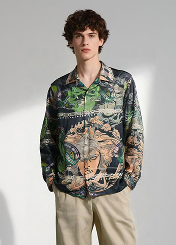
A custom baroque shirt manufacturer has to solve more than a visual brief: buyers need custom baroque print shirts for premium men’s collections that look distinctive without becoming difficult to wear, while brands need private-label baroque shirts for men with repeatable quality and luxury custom baroque shirts that survive production and retail handling. Baroque and rococo motifs, silk twill, and ornamental pattern design provide the visual language; GSM, colorfastness, and pattern grading provide the professional controls that determine whether the concept works beyond pictures.
A baroque print can make a premium men’s collection recognizable within seconds, but recognition is not the same as commercial success. A shirt may photograph well under studio lighting and still look excessive in daylight, feel too warm during summer wear, or lose definition after laundering. For that reason, the evaluation should connect the artwork to fabric, fit, production method, price, and the customer’s actual wardrobe.
The historical reference is also worth handling accurately. Baroque art developed in Europe from the late sixteenth century into the eighteenth century, with regional differences in architecture, painting, textiles, and decoration. Modern fashion prints often borrow selected features—scrolls, acanthus leaves, shell forms, crowns, florals, architectural frames, and high-contrast symmetry—rather than reproducing a single historical style. Calling every ornate print “baroque” can weaken a collection’s design direction, so the product brief should define the motif family before sampling begins.
The first advantage is immediate shelf and screen visibility. Large-scale scrollwork or controlled gold-and-black contrast can be recognized more quickly than a small geometric repeat, especially in product thumbnails and short social-media videos. This does not guarantee sales, but it gives the collection a clearer visual signature.
For Meninthemirror or any label developing a seasonal capsule, a single motif can be adapted across shirts, scarves, overshirts, and lining details. The brand may use a full front-and-back placement for a statement piece, then reduce the same artwork to a collar insert or cuff detail for a quieter product. This creates assortment coherence without making every garment identical.
Baroque artwork can be produced on several fabric bases, allowing a collection to use the same design language at different price points. A lightweight cotton poplin may suit an accessible premium shirt, while silk twill or a silk-blend fabric can support a more formal product. The fabric itself changes the result: silk reflects light and increases color depth, whereas matte cotton produces a flatter and more casual appearance.
Fabric weight should be specified rather than described as simply “premium.” A shirt fabric around 100–130 GSM is commonly associated with a light, warm-weather feel, while a fabric around 140–180 GSM generally provides more opacity and structure. These ranges are indicative rather than universal; yarn count, weave, fiber content, and finishing also affect hand feel. A supplier should provide the actual GSM test result for the approved fabric lot.
Ornamental prints can communicate ceremony, heritage, travel, or evening dressing without requiring complex garment construction. That makes them useful when a brand wants visual impact while keeping the base shirt pattern relatively simple. A classic camp-collar shirt, for example, can carry a dramatic print while using standard components such as a straight hem, button front, and side vents.
The narrative becomes stronger when the print is scaled according to garment purpose. A repeat measuring approximately 8–15 centimeters can create a visible pattern on a regular shirt, while a larger placement of 25 centimeters or more may be better suited to a resort shirt or a front-panel statement. The correct scale depends on body size, shirt silhouette, and artwork density. The same repeat can appear elegant on an oversized cut and crowded on a slim-fit shirt.
Digital textile printing is often practical for short or medium runs because it avoids the engraved screens required by traditional rotary screen printing. It also makes sampling multiple colorways easier. A brand can test navy with antique gold, ivory with burgundy, or charcoal with copper before committing to a larger order.
That flexibility matters when the artwork contains many colors or fine tonal transitions. However, digital printing does not automatically mean superior durability. The print system, ink chemistry, fabric pretreatment, curing or fixation, washing method, and fiber type all influence performance. A reliable approval process should include a physical strike-off on the final fabric rather than approval from a computer-rendered image alone.
The most common design risk is excess density. A dark ground, metallic-looking highlights, large motifs, and high contrast may compete for attention instead of creating hierarchy. The result can feel theatrical in a product image but difficult to combine with trousers, jackets, or shoes in everyday use.
A practical solution is to control at least one of the three variables: motif scale, contrast, or color count. For example, a collection may keep the motif detailed but reduce the palette to three principal colors plus the ground. Another option is to use a smaller repeat on the body and reserve the largest artwork for the back yoke or pocket area. Reviewing both full-length pictures and close-up pictures helps identify whether the design works at retail distance and at arm’s length.
Detailed artwork requires more sampling decisions than a plain shirt. The brand may need to approve motif scale, repeat direction, placement, color separation, fabric base, print method, and seam matching. Each additional round can increase development time and sample expense.
The exact cost depends on the factory, order quantity, artwork condition, and fabric. Instead of assuming that custom printing is expensive by definition, request a written quotation that separates artwork preparation, sampling, fabric minimums, print setup, garment production, testing, packaging, and shipping. This makes it easier to identify whether the cost comes from the print process or from a low-volume order.
Placement errors are more visible on ornate designs than on small all-over repeats. If a central scroll lands several centimeters off the placket, or if a large flower is cut through the chest pocket, the garment can look unfinished. Matching a repeat across side seams and pockets also increases fabric consumption.
The avoidance method is straightforward but must be documented. The technical pack should show the artwork’s grain direction, center-front position, collar placement, pocket placement, acceptable tolerance, and whether the print must align across seams. A pre-production sample should be inspected on a three-dimensional garment, because a flat fabric panel cannot show how the artwork changes over the chest, shoulder, and curved sleeve.
Dark backgrounds and saturated red, blue, or gold-like tones can show fading, crocking, or color transfer if the fabric and print system are poorly matched. “Colorfast” is not a single universal result; performance depends on the test method and the intended use. A buyer should ask which standard was used and request the report rather than accepting a general claim.
Useful checks can include colorfastness to washing, rubbing, perspiration, and light, selected according to the garment’s market and care instructions. For example, dry rubbing evaluates whether color transfers when a dry material contacts the surface, while wet rubbing introduces moisture and can produce a different result. A supplier should state the test method, rating scale, fabric composition, and tested production lot.
Consumers should also receive realistic care guidance. A delicate printed shirt may require cold or low-temperature washing, mild detergent, reduced mechanical action, and drying away from direct sunlight. If the final care label recommends dry cleaning, that instruction should be based on fabric and print testing rather than assumption. Care complexity can reduce repeat purchases if it is not communicated clearly.
Begin with a design brief that answers practical questions: What is the target retail price? Who will wear the shirt? Is the garment intended for office styling, evening use, resort travel, or editorial display? Which parts of the artwork are essential, and which can be simplified if production requires it?
Supply vector artwork or a high-resolution file with clear color references whenever possible. A low-resolution image enlarged for fabric can produce blurred edges and broken details. The manufacturer should confirm the repeat size in centimeters, the print direction, the color system used for matching, and the expected tolerance between the approved strike-off and bulk production.
Approve in stages. First review the artwork on screen, then a printed fabric swatch, then a sewn sample, and finally a pre-production sample from the intended bulk fabric. These stages answer different questions. The swatch tests color and surface interaction; the sewn sample tests placement and scale; the pre-production sample checks whether the approved result can be repeated.
Request fiber composition, fabric width, GSM, weave type, shrinkage data, and finishing details. A 100% silk shirt and a polyester satin shirt may both appear glossy in pictures, but they differ in breathability, drape, care requirements, and price. Cotton, viscose, polyester, silk, and blends should not be presented as interchangeable materials.
Measure the finished garment against a tolerance chart covering chest, shoulder, sleeve length, body length, collar, and cuff. The acceptable tolerance should be agreed before production; many apparel programs use different tolerances for different measurements, so one universal number would be misleading. Check seam strength, button attachment, buttonhole density, skipped stitches, loose threads, and print registration at the same time.
Quality control should combine visual inspection with measurable tests. A useful inspection plan may record the number of defects, defect location, measurement deviation, print misregistration, shade variation, and packaging damage. If the brand uses an acceptance sampling plan, the sampling level and acceptable quality limit should be agreed in the purchase order rather than invented after delivery.
For repeat orders, retain an approved reference sample and a sealed fabric swatch. Compare bulk goods under consistent lighting, because warm showroom lighting can hide shade differences that become obvious in daylight. The record should include fabric lot, print lot, production date, wash-care wording, and the final approved pictures. This documentation helps separate a genuine production variation from a difference caused by photography or display settings.
They can be worth using when the collection needs a recognizable statement, the target customer accepts expressive dressing, and the brand has enough development control to manage artwork, fabric, placement, and care information. The strongest use case is usually a balanced assortment: one or two high-impact printed shirts supported by solid-color trousers, knitwear, jackets, or accessories.
The purchase is less suitable when the customer expects quiet basics, the sales channel depends entirely on simple wardrobe staples, or the production quantity is too small to absorb several sampling rounds. A bold print can also create inventory risk if the design is tied too closely to one season or cultural reference.
A sensible decision can be made with a small pilot. Test two colorways, one fabric base, and two scales rather than launching a large range immediately. Track sell-through, return reasons, customer comments about styling and care, and repeat demand. If the data shows that customers like the artwork but hesitate over full coverage, the next release can move the motif to the collar, cuffs, back panel, or inner placket.
Choose high-contrast, large-scale baroque prints for fashion-led capsules, editorial campaigns, resort dressing, and customers who actively seek distinctive garments. Use reduced palettes and smaller repeats for premium daily wear. Silk and silk-blend fabrics can support formal shine, while cotton and viscose-based fabrics may provide a softer entry point, subject to verified composition and care performance.
For buyers working with a custom baroque shirt manufacturer, the minimum professional checklist is clear: approve a physical strike-off, confirm GSM and fiber content, test colorfastness using stated methods, inspect print placement on a sewn garment, define measurement tolerances, and retain reference samples. Use pictures to judge scale and styling, but use physical samples and test records to judge production reliability.
In the end, baroque prints are neither automatically luxurious nor automatically impractical. Their value comes from controlled contrast, suitable fabric, accurate placement, and a customer who understands the visual language. When those conditions are present, custom baroque print shirts can give a men’s collection measurable identity without requiring complicated construction; when they are ignored, the same ornamental pattern can increase cost, care complaints, and unsold inventory.
Latest News

Leisure Collar Shirt Fit Review: Balance, Drop, and Mobility
When a customer needs a leisure collar shirt supplier for office-casual wear, travel, or weekend use, the real problem is rarely color alone: the shirt must fit the neck without choking, sit cleanly across the shoulders, and allow reaching without pulling at the buttons. This review examines a leisure collar long sleeve shirt for men through three practical measures—collar stand, shoulder seam
Jan. 01, 1970
Pros and Cons of Baroque Prints for Premium Men's Collections
A custom baroque shirt manufacturer has to solve more than a visual brief: buyers need custom baroque print shirts for premium men’s collections that look distinctive without becoming difficult to wear, while brands need private-label baroque shirts for men with repeatable quality and luxury custom baroque shirts that survive production and retail handling. Baroque and rococo motifs, silk
Jan. 01, 1970
Top Packaging Details to Confirm for Export Shirt Orders
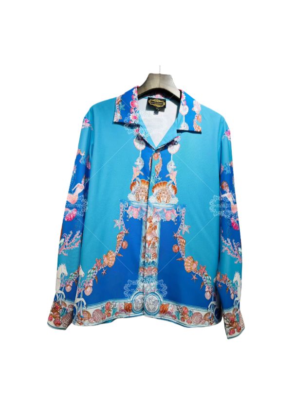
For an export shirt supplier, packaging is no longer a final warehouse task; it is part of the buyer’s quality specification. Retailers now expect custom export shirt packaging to protect collars, control freight volume, and meet destination-market rules, while a wholesale shirt packaging requirements checklist helps prevent chargebacks and customs delays. Before approving a purchase order,
Jan. 01, 1970
Let's Take This Forward!
Feel free to reach out for any queries. We would be happy to help!

